[css]代码库
<style type="text/css">
.button {
	display: inline-block;
	white-space: nowrap;
	background-color: #ccc;
	background-image: -webkit-gradient(linear, left top, left bottom, from(#eee), to(#ccc));
	background-image: -webkit-linear-gradient(top, #eee, #ccc);
	background-image: -moz-linear-gradient(top, #eee, #ccc);
	background-image: -ms-linear-gradient(top, #eee, #ccc);
	background-image: -o-linear-gradient(top, #eee, #ccc);
	background-image: linear-gradient(top, #eee, #ccc);
filter: progid:DXImageTransform.Microsoft.gradient(startColorStr='#eeeeee', EndColorStr='#cccccc');
	border: 1px solid #777;
	padding: 0 1.5em;
	margin: 0.5em;
	font: bold 1em/2em Arial, Helvetica;
	text-decoration: none;
	color: #333;
	text-shadow: 0 1px 0 rgba(255, 255, 255, .8);
	-moz-border-radius: .2em;
	-webkit-border-radius: .2em;
	border-radius: .2em;
	-moz-box-shadow: 0 0 1px 1px rgba(255, 255, 255, .8) inset, 0 1px 0 rgba(0, 0, 0, .3);
	-webkit-box-shadow: 0 0 1px 1px rgba(255, 255, 255, .8) inset, 0 1px 0 rgba(0, 0, 0, .3);
	box-shadow: 0 0 1px 1px rgba(255, 255, 255, .8) inset, 0 1px 0 rgba(0, 0, 0, .3);
}
.button:hover {
	background-color: #ddd;
	background-image: -webkit-gradient(linear, left top, left bottom, from(#fafafa), to(#ddd));
	background-image: -webkit-linear-gradient(top, #fafafa, #ddd);
	background-image: -moz-linear-gradient(top, #fafafa, #ddd);
	background-image: -ms-linear-gradient(top, #fafafa, #ddd);
	background-image: -o-linear-gradient(top, #fafafa, #ddd);
	background-image: linear-gradient(top, #fafafa, #ddd);
filter: progid:DXImageTransform.Microsoft.gradient(startColorStr='#fafafa', EndColorStr='#dddddd');
}
.button:active {
	-moz-box-shadow: 0 0 4px 2px rgba(0, 0, 0, .3) inset;
	-webkit-box-shadow: 0 0 4px 2px rgba(0, 0, 0, .3) inset;
	box-shadow: 0 0 4px 2px rgba(0, 0, 0, .3) inset;
	position: relative;
	top: 1px;
}
.button:focus {
	outline: 0;
	background: #fafafa;
}
.button:before {
	background: #ccc;
	background: rgba(0, 0, 0, .1);
	float: left;
	width: 1em;
	text-align: center;
	font-size: 1.5em;
	margin: 0 1em 0 -1em;
	padding: 0 .2em;
	-moz-box-shadow: 1px 0 0 rgba(0, 0, 0, .5), 2px 0 0 rgba(255, 255, 255, .5);
	-webkit-box-shadow: 1px 0 0 rgba(0, 0, 0, .5), 2px 0 0 rgba(255, 255, 255, .5);
	box-shadow: 1px 0 0 rgba(0, 0, 0, .5), 2px 0 0 rgba(255, 255, 255, .5);
	-moz-border-radius: .15em 0 0 .15em;
	-webkit-border-radius: .15em 0 0 .15em;
	border-radius: .15em 0 0 .15em;
	pointer-events: none;
} /* Hexadecimal entities for the icons */
.add:before {
	content: "\271A";
}
.edit:before {
	content: "\270E";
}
.delete:before {
	content: "\2718";
}
.save:before {
	content: "\2714";
}
.email:before {
	content: "\2709";
}
.like:before {
	content: "\2764";
}
.next:before {
	content: "\279C";
}
.star:before {
	content: "\2605";
}
.spark:before {
	content: "\2737";
}
.play:before {
	content: "\25B6";
}
</style>


调用:<input name="" type="button" class="button" value="CSS3 Button" />
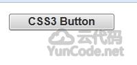
[代码运行效果截图]

 AI时代,找源码已成为过去式,纪念我过去的十年0(回)
328天前
AI时代,找源码已成为过去式,纪念我过去的十年0(回)
328天前 还有人吗2(回)
346天前
还有人吗2(回)
346天前 这里还有人吗2(回)
1011天前
这里还有人吗2(回)
1011天前 每天面对着电脑屏幕,敲打键盘。我所面对的并不只是代码,而是一种生活方式。0(回)
1235天前
每天面对着电脑屏幕,敲打键盘。我所面对的并不只是代码,而是一种生活方式。0(回)
1235天前