[css]代码库
<!DOCTYPE html>
<html>
<head>
<meta http-equiv="Content-Type" content="text/html; charset=utf-8" />
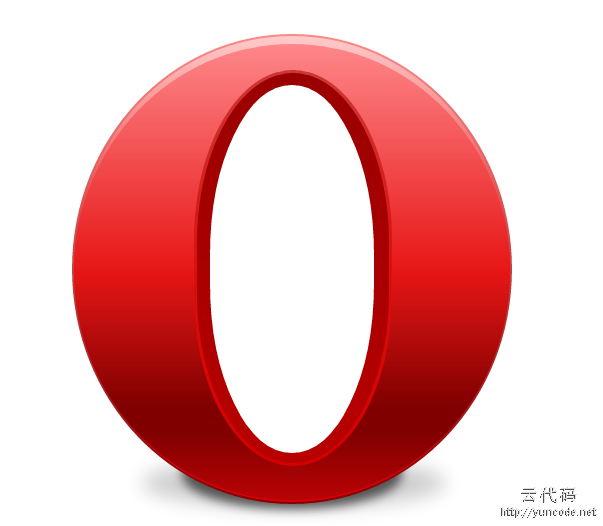
<title>css3 欧朋浏览器logo</title>
<style>
.oplogo{width:512px; height:512px; margin:0 auto; position:relative; overflow:hidden; top:50px;}
.oplogo div{position:absolute;}
/****** 外 圆******/
.outround{width:440px; height:470px; background-color:#800; background:-moz-linear-gradient(-90deg,#F88,#800); background:-webkit-gradient(linear,0 top,0 bottom, from(#F88),to(#800)); top:20px; left:36px; -moz-border-radius:220px/235px;
-webkit-border-radius:220px 235px; border-radius:220px/235px;}
/****** 边框高光 ******/
.highlight{width:436px; height:466px; background-color:#d40009; background:-moz-linear-gradient(-90deg, #FCC, #E71616 50%, #d40009); background:-webkit-gradient(linear, 0 top, 0 bottom, from(#FCC), color-stop(50%, #E71616), to(#d40009)); top:22px; left:38px; border-radius:218px/233px; -moz-border-radius:218px/233px;-webkit-border-radius: 218px 233px;}
/****** 上部高亮 ******/
.fill{width:436px; height:456px; background-color:#E71616; background: -moz-linear-gradient(-90deg, #FE878A, #E71616 50%, #800000 80%, #800000 85%, #b80304); background:-webkit-gradient(linear, 0 top, 0 bottom, from(#FE878A), to(#b80304), color-stop(50%, #E71616), color-stop(80%, #800000), color-stop(85%, #800000) ); top:30px; left:38px; border-radius:218px/228px; -moz-border-radius:218px/228px; -webkit-border-radius:218px 228px;}
/****** 内 圆 ******/
.inround{width:198px; height:396px; background-color:#d20000;background:-moz-linear-gradient(-90deg, #cc3836, #d9100f 50%, #d20000); background:-webkit-gradient(linear, 0 top, 0 bottom, from(#cc3836), color-stop(50%, #d9100f), to(#d20000));left:158px; top:56px; border-radius:99px/170px; -moz-border-radius:99px/170px; -webkit-border-radius:99px 170px;}
/****** 内填充 ******/
.inside{width:192px; height:390px; background-color:#b80000; background:-moz-linear-gradient(-90deg, #9a0000, #b80000); background:-webkit-gradient(linear, 0 top, 0 bottom, from(#9a0000), to(#b80000)); left:161px; top:59px; border-radius:96px/170px; -moz-border-radius:96px/170px; -webkit-border-radius:96px 170px;}
/****** 内镂空 ******/
.counter {width:164px; height:368px; background-color:#FFF; left:174px; top:71px; border-radius: 2px/170px; -moz-border-radius: 82px/170px; -webkit-border-radius:82px 170px;}
/****** 亮阴影 ******/
.lightshdow{left:106px; top:344px; height:50px; width:304px; border-radius:152px/25px;
moz-border-radius:152px/25px; -webkit-border-radius:152px 25px; box-shadow:0 100px 30px hsla(0,0%,0%,.2); -moz-box-shadow:0 100px 30px hsla(0,0%,0%,.2); -webkit-box-shadow:0 100px 30px hsla(0,0%,0%,.2);}
/****** 暗阴影 ******/
.darkshdow{left:146px; top:325px; height:70px; width:220px; border-radius:110px/35px;
moz-border-radius:110px/35px;; -webkit-border-radius:110px 35px;; box-shadow:0 100px 15px hsla(0,0%,0%,.6); -moz-box-shadow:0 100px 15px hsla(0,0%,0%,.6); -webkit-box-shadow:0 100px 15px hsla(0,0%,0%,.6);}
</style>
</head>
<body>
<div class="oplogo">
<div class="lightshdow"></div>
<div class="darkshdow"></div>
<div class="outround"></div>
<div class="highlight"></div>
<div class="fill"></div>
<div class="inround"></div>
<div class="inside"></div>
<div class="counter"></div>
</div>
</body>
</html>
[代码运行效果截图]

 AI时代,找源码已成为过去式,纪念我过去的十年0(回)
328天前
AI时代,找源码已成为过去式,纪念我过去的十年0(回)
328天前 还有人吗2(回)
346天前
还有人吗2(回)
346天前 这里还有人吗2(回)
1011天前
这里还有人吗2(回)
1011天前 每天面对着电脑屏幕,敲打键盘。我所面对的并不只是代码,而是一种生活方式。0(回)
1235天前
每天面对着电脑屏幕,敲打键盘。我所面对的并不只是代码,而是一种生活方式。0(回)
1235天前